How to Make Screenshots Look Professional (Free Beautifier)
Turn plain screenshots into polished images: add a gradient background, padding, rounded corners, and a soft shadow, or apply a one-click theme. Free, no watermark.
Por Kartik Labhshetwar, criador do Screenshot StudioAtualizado em 2 min de leitura

Resposta rápida
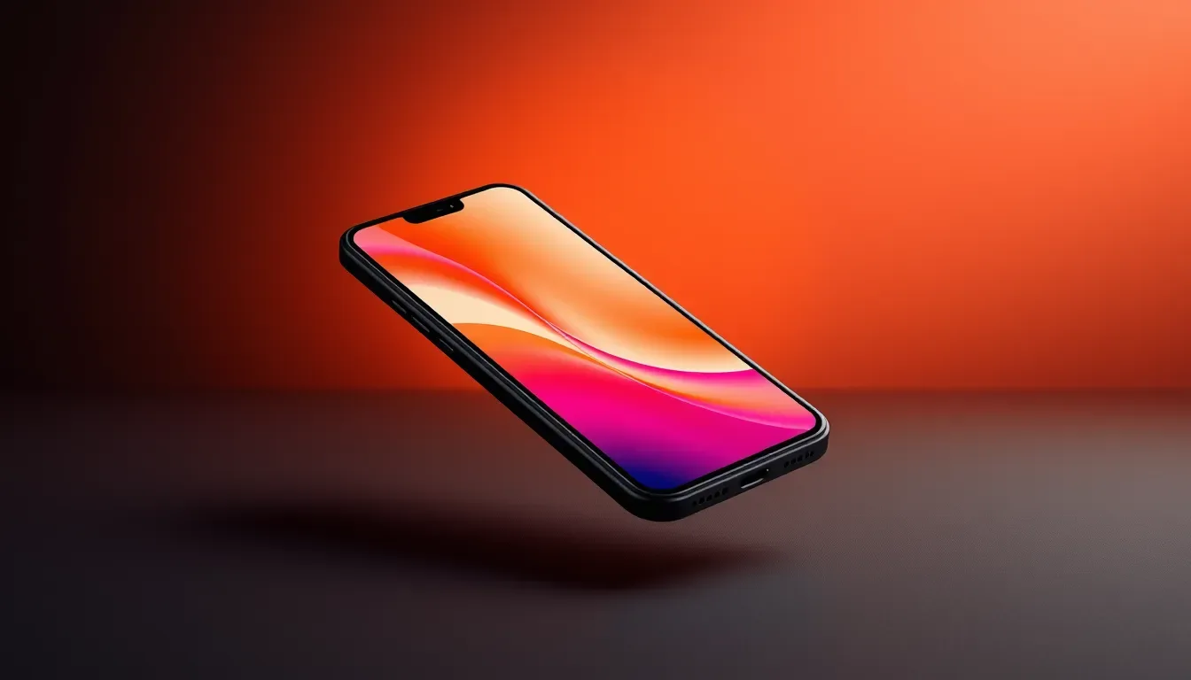
To make a screenshot look professional, give it breathing room and depth: place it on a gradient or wallpaper background, add padding, round the corners, and add a soft shadow. In Screenshot Studio that takes under a minute, and Design Themes apply a full look in one click.
Passo a passo
- 1
Open the editor and add your screenshot
Go to screenshot-studio.com/editor and paste with Cmd+V (Ctrl+V on Windows), drag the file onto the page, or click to browse. PNG, JPG, and WebP files up to 100MB work, and there is no account to create.
- 2
Pick a background
In the BG tab, try Magic Gradients and press Shuffle until one fits, or pick a mesh, classic gradient, wallpaper, or solid color. Background Effects add grain or a subtle grid, dot, or line pattern.
- 3
Round the corners and add a shadow
In the Design tab, set Border to Curved or Round and adjust the radius, then choose a Soft or Strong shadow so the screenshot lifts off the background.
- 4
Try a style or theme
Style offers Glass Light, Glass Dark, Outline, and Border treatments. Design Themes such as Glass, Neon, Minimal, Vintage, Dark Elegant, and Polaroid change several settings at once.
- 5
Match the canvas to where it will be posted
Use the size picker in the top bar for Instagram, X, LinkedIn, YouTube, Pinterest, and more, or type a custom width and height.
- 6
Export or copy the result
Open Save in the top bar, pick PNG, JPEG, or WebP, choose 1x, 2x, or 3x resolution, and download. Copy puts a 2x PNG on your clipboard so you can paste it straight into Slack, Docs, or an email.
Why beautified screenshots perform better
A raw screenshot looks like a work in progress. The same image on a calm background with even padding looks like something a team chose to show. That difference matters on landing pages, launch posts, and pitch decks, where people decide in a second whether to keep reading.
A simple recipe that always works
When in doubt, use this combination and adjust from there.
- A soft two-color gradient pulled from your product's brand colors.
- Enough padding that the background shows on every side.
- A curved border radius so the corners match modern UI.
- A soft shadow, not a strong one, so the image lifts without looking heavy.
- Grain at a low percentage to stop large gradients from banding.